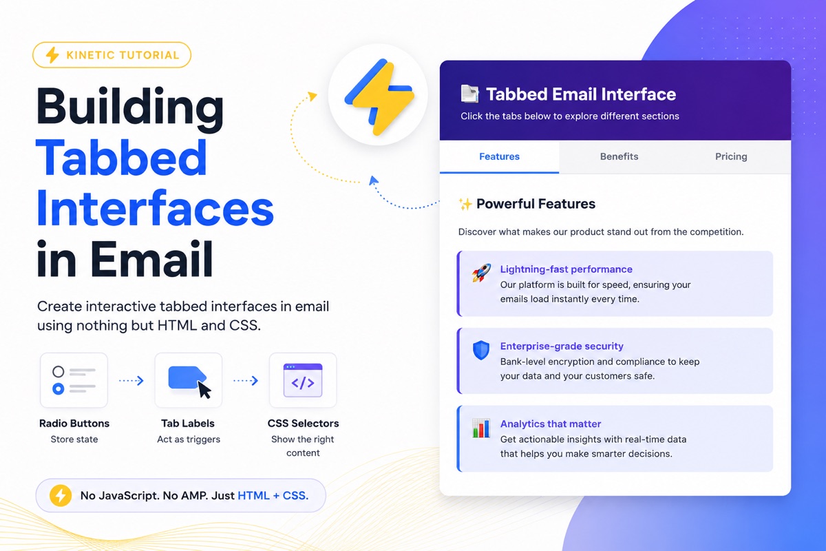
Building Tabbed Interfaces in Email
By Sean · February 16, 2026 · 5 min read
Tabs are one of the most practical kinetic email patterns. They let you pack multiple sections of content into a single view, giving subscribers the power to explore at their own pace without scrolling through a wall of text.
The best part? They work using nothing but radio buttons and CSS selectors. No JavaScript. No AMP. Just HTML and CSS that email clients already support.
How It Works
The pattern is simple: hidden radio buttons store state, labels act as clickable tab headers, and CSS :checked selectors control which content panel is visible.
Here's the core structure:
<input type="radio" id="tab1" name="tabs" checked>
<input type="radio" id="tab2" name="tabs">
<input type="radio" id="tab3" name="tabs">

<div class="tab-headers">
  <label for="tab1">Tab 1</label>
  <label for="tab2">Tab 2</label>
  <label for="tab3">Tab 3</label>
</div>

<div class="tab-content">
  <div class="panel panel-1">Content for tab 1</div>
  <div class="panel panel-2">Content for tab 2</div>
  <div class="panel panel-3">Content for tab 3</div>
</div>
Radio buttons enforce mutual exclusion — only one can be selected at a time. When a user clicks a tab label, the corresponding radio button gets checked, and CSS takes care of the rest.
The CSS
The magic is in the sibling selectors. Each radio button's :checked state controls the visibility of its corresponding content panel:
/* Hide all panels by default */
.panel { display: none; }

/* Show the active panel */
#tab1:checked ~ .tab-content .panel-1 { display: block; }
#tab2:checked ~ .tab-content .panel-2 { display: block; }
#tab3:checked ~ .tab-content .panel-3 { display: block; }

/* Style the active tab header */
#tab1:checked ~ .tab-headers label[for="tab1"],
#tab2:checked ~ .tab-headers label[for="tab2"],
#tab3:checked ~ .tab-headers label[for="tab3"] {
  background-color: #2563eb;
  color: white;
}
The general sibling combinator (~) is the key. It lets the checked radio button influence elements that come after it in the DOM, regardless of nesting depth.
Live Example
Here's a working tabbed interface built with this exact pattern. Click the tabs to switch between content panels:
Email Client Support
Tabbed interfaces work in most modern email clients that support the :checked pseudo-class:
| Client | Support |
|---|---|
| Apple Mail | Full |
| Gmail (iOS) | None |
| Samsung Mail | Full |
| Yahoo Mail | Partial |
| Outlook | None |
| Outlook (web) | Partial |
| Outlook (iOS) | Partial |
| Gmail (web) | None |
For clients that don't support :checked, you'll want a fallback that shows all content stacked vertically. The lightswitch pattern handles this gracefully — check out our lightswitch module for details.
Tips for Production
- Keep tab count reasonable. 3–5 tabs works well. More than that and the headers get cramped on mobile.
- Default to the most important tab. The first radio button should have
checkedso users see content immediately. - Add transitions. A subtle
opacityormax-heighttransition makes tab switching feel polished. - Test the fallback. Always verify your email is usable when the interactive elements don't render.
Want to build this yourself? Head to the Tabbed Elements module in our learning section for a hands-on walkthrough with exercises.
Tabbed interfaces are one of those patterns that feel like they shouldn't work in email — but they do. And once you've built one, you'll start seeing opportunities to use them everywhere.